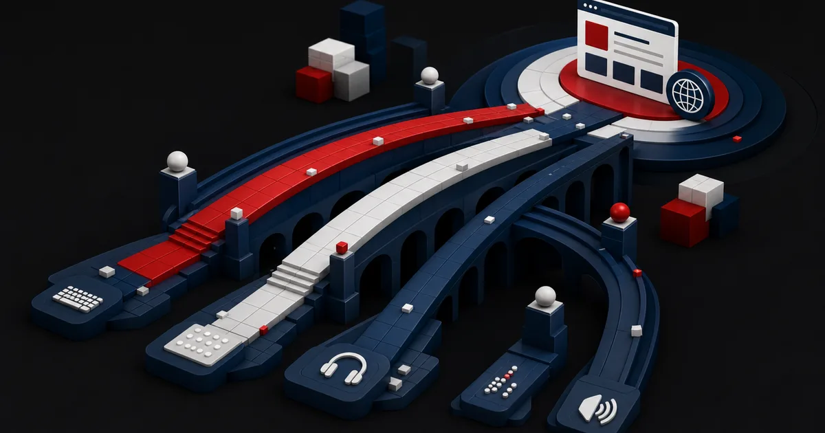
When someone lands on your site, they are not there to learn your org chart. They want an answer to their own question, a clear way to tell the options apart, and a safe next step. Yet plenty of sites keep growing the menu around company departments, content types, or service names that piled up over the years. The right information is there but nobody can find it, the same topic repeats in three places, and the CTAs ask for a sale before the visitor is ready. Information architecture clears that clutter not by rearranging the menu, but by redefining what the content means and how the pieces relate.
The W3C Web Accessibility Initiative explains that well-structured content makes pages easier to navigate and easier to process, and that marking up regions, headings, and content relationships in meaningful HTML supports people who rely on screen readers, keyboard navigation, or cognitive accessibility. The same principle holds at site level: the category name, the page title, the link text, and the hierarchy all have to tell visitors where they are, what they will find, and where they can go next. Conversion starts by establishing that sense of direction, long before you add another button.W3C Web Accessibility Initiative — Page Structure tutorial (opens in a new tab)
1. Map user tasks before you list pages
The input to information architecture is not the current menu, it is the set of tasks people are trying to complete. On a services site those tasks might be: recognize the problem, compare possible approaches, check whether they qualify, see the evidence, understand what the cost covers, and start a conversation. In ecommerce the leading tasks are finding a product, filtering, confirming compatibility, understanding delivery, and buying. Validate the task list against user interviews, site search, support tickets, analytics paths, and the questions sales hears every week.
For each task, write down the starting knowledge, the decision question, the evidence required, and the acceptable next step. Visitors do not always begin at the home page. They arrive from a search engine on a deep guide, from a campaign on a product page, or from a shared link on a case study. Every page that matters therefore has to set its own context, show which category it belongs to, and offer a meaningful path both backward and forward.
Put the business goal on the task map, but do not let it take over the map. If a visitor can quickly tell that you are not the right fit, that is also a successful experience: it saves them a form and saves you a sales call.
2. Build the content model and the hierarchy together
A content model defines pages as reusable fields and relationships, not just as titles. When the audience for a service, the problem it solves, the stages of the process, the supporting evidence, the related guides, and the CTA each live in their own field, pages can be produced consistently. The same information is managed from one source instead of being copied around. The model is the meaning layer behind the design template, and the CMS screen should make those decisions visible.
Hierarchy runs from broad to specific, but it does not have to mirror the way the organization is structured. Name top-level categories with concepts your audience already recognizes, and keep sibling categories at a comparable level of abstraction. Putting 'Solutions', 'Company', 'Blog', and one specific product name on the same level makes the logic of choosing impossible to read. Card order, breadcrumbs, and local navigation all have to reinforce the same classification.
| Page role | User question | Core content | Fitting CTA |
|---|---|---|---|
| Category | Which path fits me? | Options and the criteria that separate them | Choose a sub-path |
| Service | Does this offer solve my problem? | Fit, scope, process, limits | Schedule a conversation |
| Guide | How should I make the decision? | Framework, examples, checklist | Evaluate the related service |
| Case study or evidence | Is this approach dependable? | Context, method, verifiable outcome | Discuss a similar need |
3. Translate labels into language visitors can predict
A menu label has to be distinctive as well as short. 'Solutions', 'Platform', or 'Resources' on their own may say nothing about what sits behind them. Test the names your audience actually uses with card sorting and tree testing. Even when a term is correct inside the company, if visitors file it under a different category you need an explanatory sub-label or a different name. Creative micro-copy should never come at the cost of predictable navigation.
The W3C guidance on writing for web accessibility recommends grouping related paragraphs under short headings and using those headings to make the outline of the content visible. Heading levels exist to express real structure, not to pick a visual size. Link text should describe its destination rather than say 'click here'. That way both people using assistive technology and visitors skimming at speed can reconstruct the logic of the page more easily.W3C Web Accessibility Initiative — Writing tips for web accessibility (opens in a new tab)
Global navigation does not have to carry every possibility. Keep the frequent and important paths visible, and leave secondary links to category pages, local navigation, and search. Preserve the same information priority on mobile, and do not stack the desktop mega menu onto a narrow screen unchanged.
4. Hypothetical scenario: from a department menu to decision paths
This example is hypothetical. It is not a real client outcome or a claim about a conversion lift. Picture an enterprise technology site whose main menu reads 'Consulting', 'Engineering', 'Operations', 'Resources', and 'Company'. User interviews show that visitors do not know the difference between those departments; they arrive with problems phrased as modernizing an old system, assessing security, and getting ongoing support. Analytics tells the same story, with many people moving back and forth between the department pages.
Inputs: twelve user tasks, an inventory of the existing 86 pages, the most frequent on-site searches, the qualifying questions sales asks, and recordings of mobile navigation. Reasoning: three departments describe similar services in different words. The tasks cluster into three solution paths named 'Plan the transformation', 'Build a new product', and 'Run the system'. The specialist departments stay at the service-detail level and come out of the top choice layer. Evidence, process, and related guides connect to each path through one shared content model.
Decision: the new architecture is tested first in a card sorting and tree testing prototype, and the two most troublesome paths become a clickable prototype before anyone codes the whole site. Old URLs are mapped to new destinations through a content matching table, and pages with no true equivalent are not redirected to the home page by default. Success is judged by task completion, wrong-path selection, back-navigation, and the context of qualified form submissions, not by an assumed uplift.
5. Design the decision order and the CTA inside the page
Even with the right site map, the flow inside a page can break the decision. The opening section states who the page is for and what outcome it delivers. Then come the problem context, the options or approach, the scope, the process, the evidence, the limits, and the next step. That order does not have to be identical for every service, but asking for a form before visitors have the evidence they need creates a trust gap. Offer secondary paths that suit different decision stages: read the guide, compare requirements, review an example.
A CTA label should name both the action and the outcome. 'Share your project scope' instead of 'Submit', or 'See the implementation steps' instead of 'Learn more', removes ambiguity. Before the form, explain how long it takes, who the visitor will talk to, what information you are asking for, and what happens afterward. For conversion, design predictability rather than surprise.
Do not pile internal links into an SEO box at the foot of the page. Link to the relevant comparison or piece of evidence in the paragraph where the visitor's new question appears. The destination should move the decision forward rather than repeat what they just read.
6. Test the architecture with real tasks
Card sorting shows how people group concepts. Tree testing measures whether they can find the right path with no visual design at all. Usability testing evaluates labels, content, and interaction together. Each method answers a different question. The opinions of five people are not mathematical proof about a whole market, but they surface recurring wayfinding problems early. Recruit participants who match the real target roles and tasks.
In live measurement, do not look only at CTA clicks. On-site search terms, searches with no results, repeated menu opening, breadcrumb use, returns to the category, wrong form selection, and support requests are all architectural signals. Respect user consent and data minimization, since recording every cursor movement is rarely necessary. Explain the quantitative patterns with short interviews and support records.
Establish a task baseline before you change anything. Release the new architecture in stages and retest the most critical tasks. Note simultaneous influences such as a brand campaign or a price change, and do not attribute a difference in conversion to the menu alone.
7. Phased rollout, checklist, and limits
In discovery, inventory the tasks and the existing content. In the modeling stage, define page roles, taxonomy, and relationships. In validation, use card sorting, tree testing, and prototypes. In migration, move URL mapping, redirects, breadcrumbs, search, analytics, and content ownership together. In operation, put every request for a new page through an architectural gate; without one, the old clutter returns within a few months.
Limits and failure modes: good information architecture on its own does not fix a weak offer, thin evidence, or a slow site. Chasing the goal of reaching everything in three clicks can strip out depth, and what matters is not the click count but whether the path is understandable and low in uncertainty. Running user research only with employees preserves internal jargon. Simplifying a menu can remove accessible alternative routes. Large URL changes made without a content and SEO migration plan cost you findability.
- Primary user tasks are validated with real interview and behavioral data.
- Page roles and content fields are defined so that duplication drops.
- Category and menu labels passed tree testing in the visitor's own language.
- Every important page provides context as a standalone entry point.
- Heading levels, regions, and link text carry the meaning.
- The CTA states plainly what happens after the action.
- URL migration, redirects, and the measurement plan are ready before launch.
Conclusion
Conversion-focused information architecture is not about pushing visitors into a form by the shortest route. It is about building meaningful paths that carry them to the right decision with confidence. Start from tasks, model the content roles, test labels in the language visitors actually use, and make the CTA the natural consequence of the decision. Once you measure and manage the architecture after launch, the site turns from a department archive into a usable decision system.
Frequently Asked Questions
Sources
- W3C Web Accessibility Initiative — Page Structure tutorial (opens in a new tab)
Navigation and accessibility through regions, headings, and meaningful structure
- W3C Web Accessibility Initiative — Writing tips for web accessibility (opens in a new tab)
Meaningful headings, structure, link text, and readable content
Design decision paths where visitors find the right service
Let's bring user tasks, the content model, and conversion flows together in one accessible web architecture.
Build my site architecture with me